 Produuz.it Docs
Appearance
3D Viewer
The Viewer is the main production interface in produuz.it. It displays 3D models and technical drawings of your constructibles (assemblies and modules), and provides tools for managing production checklists, issues, logistics, and more.
Accessing the Viewer
You can open the Viewer from the constructibles list in a project. There are two viewing modes:
- Actual Viewer — For constructibles in production. Includes checklists, issues, RFID, and logistics features.
- Design Viewer — For reviewing designs before production. Shows 3D models and drawings in read-only mode (no production tools).
The list on the left
The left menu holds the queue: every constructible you can work on, in the order production follows. What sits above that list depends on how you are working.
Working by date
With no project selected, and if your company works by date, the header shows the date selector: arrows for the previous and next day, and a dropdown with a calendar and two options — whether to include constructibles that are late, and whether to cap how many are listed at a time.
Working by project
With a project selected, the header shows one control for everything that decides what the list holds. Closed, it tells you where you are:
- the phase on the top line and the batch on the bottom one, or All phases / All batches when nothing is filtered;
- how many constructibles of what is listed are ready, out of the total;
- an eye icon crossed out when ready constructibles are being hidden;
- a
×to clear the filter in one tap.
The arrows step to the previous and next batch, continuing into the next phase when you reach the end of one.
Tapping the button opens it:
- Production / Design at the top, for managers and admins. Production lists the panels and modules being built; Design lists the designs, read-only. In Design mode there are no batches, so the phase and batch list is not shown.
- Tap a phase to see its batches only.
- Tap a batch to work on that batch alone.
- Every row shows how many of its constructibles are ready. The count turns green once they all are, so a finished batch or phase is easy to spot. Batches with nothing in them are greyed out and never count as finished.
- The switch at the bottom hides constructibles that are already finished. It stays open while you use it, so you can compare.
The constructible you currently have open always stays in the list, even when the filter would leave it out, so you never lose your place.
Layout
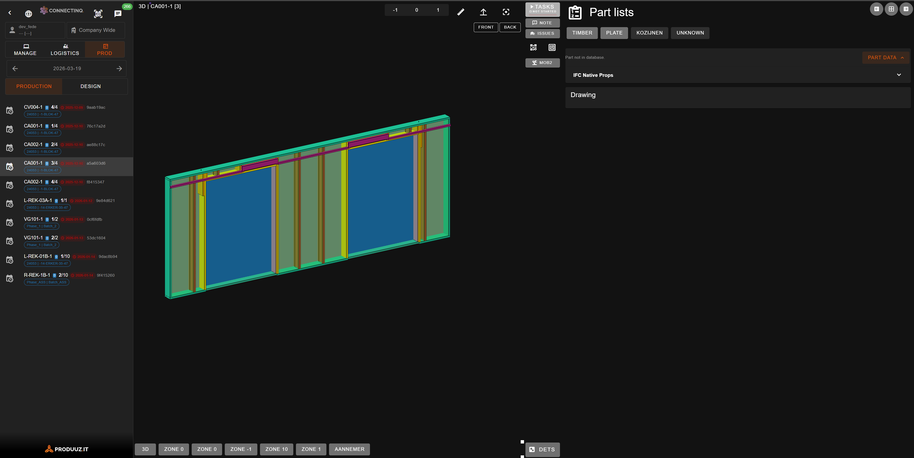
The Viewer uses a three-panel layout:
| Panel | Content |
|---|---|
| Left | 3D model or technical drawing (PDF) |
| Center | Vertical toolbar with action buttons |
| Right | Part details (BOM) or specification documents |
There are two views, switched with the chevron button at the top of the toolbar:
- Extended — All three panels. The right panel shows the panel checklist at the top and the usual drawing underneath, so a worker can tick tasks off with the drawing in front of them. The checklist button is not in the toolbar in this view: it would only open the same tasks in a dialog.
- Standard — Left panel + toolbar. The drawing takes all the width, and the checklist goes back to being a button in the toolbar.
Extended is the default on big screens, standard on phones, and your choice is remembered on that device. Both views are available on any screen: on a phone the two panels stack and share the height instead of sitting side by side.
3D Model
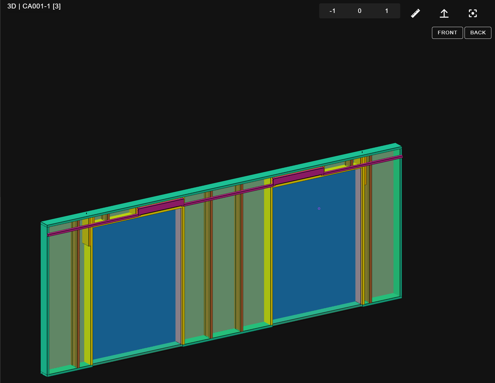
Controls
- Rotate — Click and drag to rotate the model.
- Zoom — Scroll wheel or double-click to zoom in.
- Pan — Right-click and drag to move around.
- Recenter — Click the crosshair button to reset the view.
- Front/Back — Toggle buttons to flip the camera perspective.
Selecting Parts
Click any part in the 3D model to select it. The right panel will show its properties, including:
- Zone and reference number
- Material type and dimensions
- IFC properties and property sets
- Creation date and revision number
Zone Selection
Use the zone toggle buttons to show or hide specific zones of the constructible. This is useful for focusing on a specific area during production.
For modules, you can also filter by sub-assembly using the assembly dropdown.
Advanced Tools
- Measurement — Click the ruler icon to measure distances between parts in the 3D view.
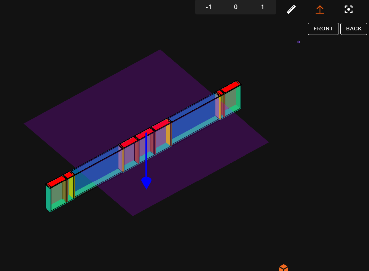
- Clipping Plane — Click the section icon to enable a cutting plane that reveals the interior structure.
Technical Drawings
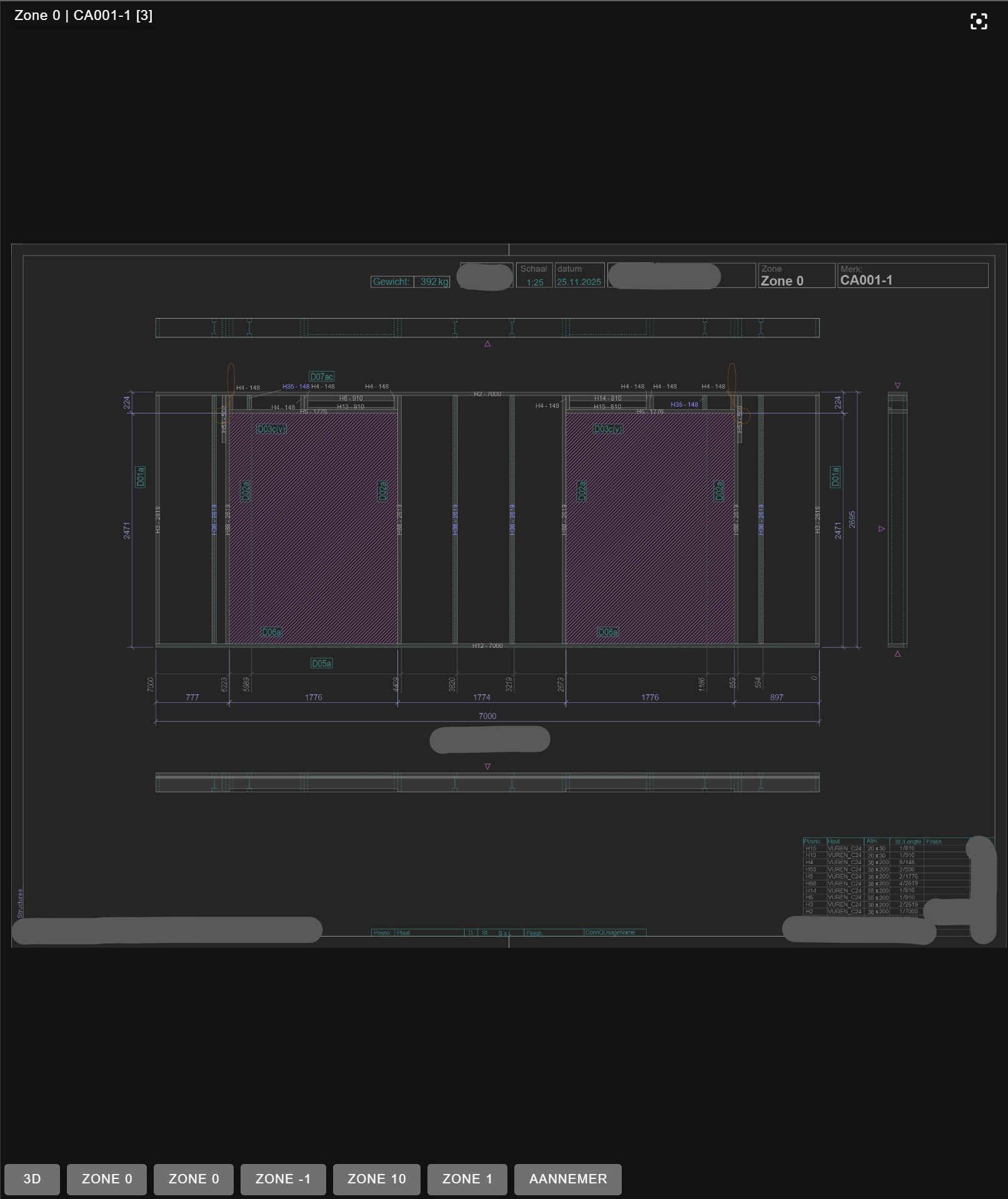
The left panel can switch between the 3D model and technical drawings (PDFs). Use the buttons at the bottom of the left panel to select which drawing to display.
- Drawings are filtered by your selected production station when applicable.
- Multi-page drawings show navigation arrows to move between pages.
- Zoom and pan controls work the same as in the 3D view.
Bill of Materials (BOM)
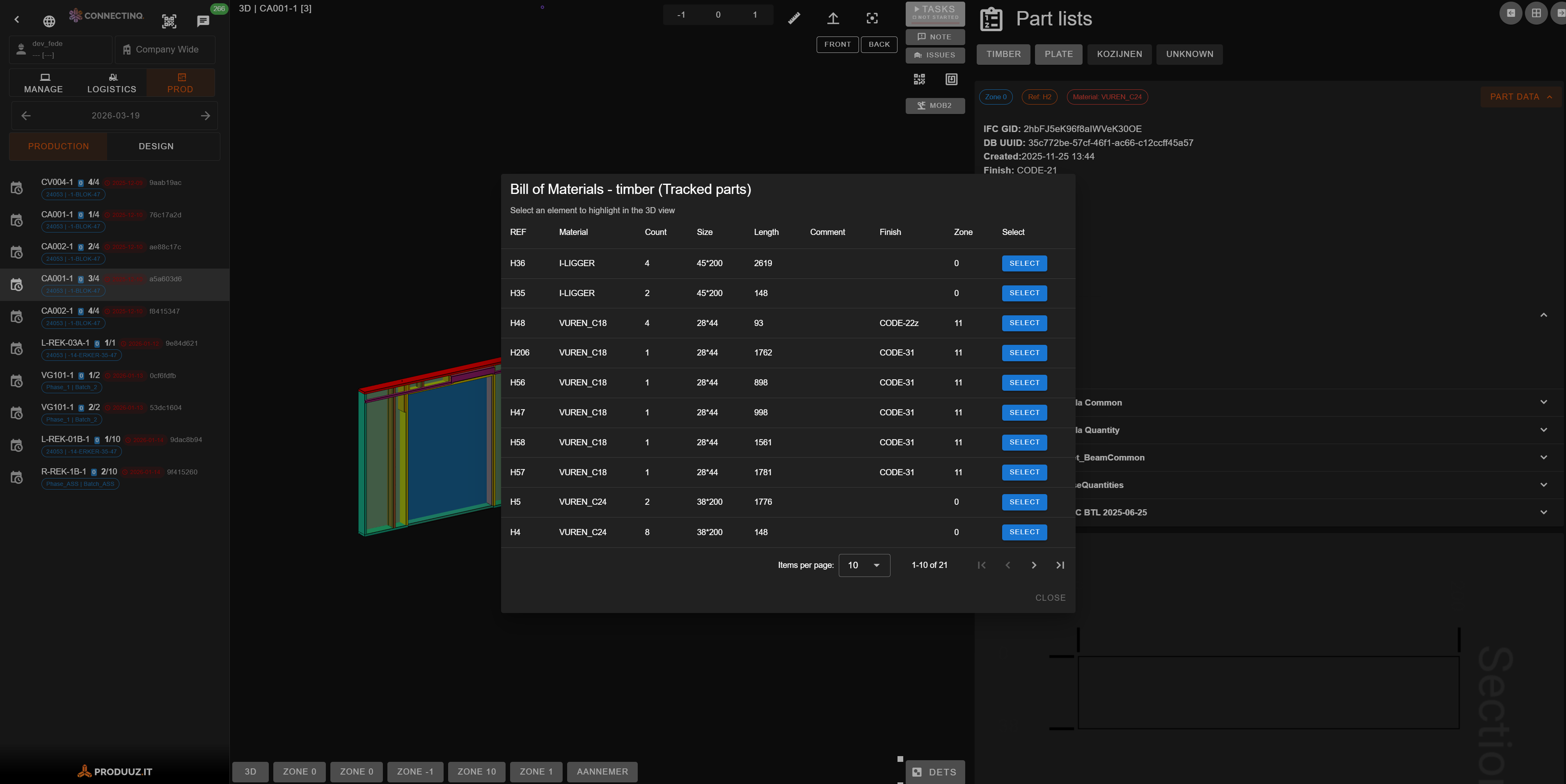
The right panel in Details mode shows the Bill of Materials for the current constructible.
Part List
A table listing all tracked parts with:
- Reference number
- Part category badge
- Specifications
- Zone location
Use the branch filter buttons (e.g., wood, metal, hardware) to show only parts from a specific construction branch.
Unknown Parts
A separate tab shows parts detected in the IFC file but not matched to the database. This helps identify parts that may need to be added to the system.
Part Drawings
When a part is selected, you can view its associated detail drawings and CAD files in the right panel.
Production Features
INFO
Production features are only available in the Actual Viewer (not in Design Viewer).
Checklist
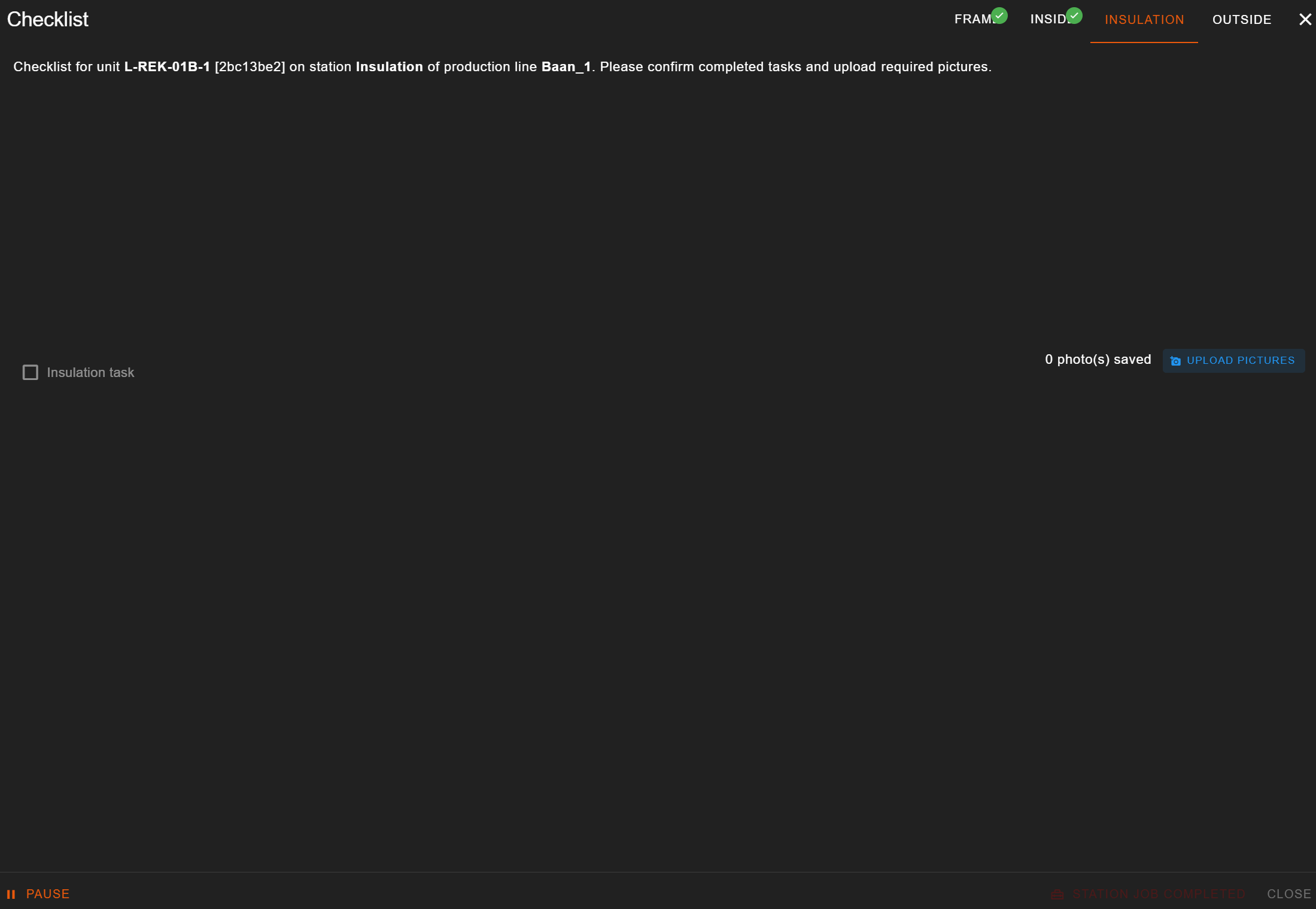
The checklist button in the toolbar shows the production progress for the current constructible at the selected station.
- Progress bar — Color-coded: red (not started), amber (in progress), green (completed).
- Task list — Each task has a checkbox, and may require:
- QR code scanning
- A picture (see below)
- Filling a custom form
- Reviewing associated documents
Tasks that need a picture
The task row has a camera button and a browse button, on every device.
On an Android tablet or phone, the camera button opens the device's own camera app: take the photo, confirm, and you are back on the checklist.
On a computer or a Windows tablet it opens the camera in a small window — one click to open, one to shoot.
The browse button picks a photo you already have. On a computer you can also drag files onto the row or paste a screenshot into it.
The photo is stored exactly as the camera took it, at full resolution. It is the quality record of the panel, so nothing is shrunk or re-compressed.
The task ticks itself when the photo is stored, as long as nothing else is missing — a form still to fill or a QR still to scan keeps it unticked. You can always untick it.
The photos stay visible after the task is ticked, as thumbnails. Tap one to see the picture full size. Clean removes them. A photo taken before this feature existed gets its thumbnail the first time somebody opens the panel, so an old panel with many pictures fills in over a couple of visits.
Each thumbnail says who uploaded it. See: Quality Control Report
If the upload fails you get a message, the thumbnail disappears and the task is not ticked, so a missing photo can never look like a stored one.
Actions:
- Start Production — Begin work on this station (required before checking tasks).
- Pause — Temporarily stop work.
- Station Job Completed — Mark the station as done (enabled when all tasks are checked).
Multiwall Checklist
When you open a Multipanel Group in the viewer, the toolbar shows a Multiwall Checklist button instead of (in addition to) the per-panel one. It aggregates the checklist of every member panel of the group at the currently selected station, so a worker can drive the whole multiwall from a single screen.
- Progress — The button shows how many panels of the group are loaded and the combined progress for the current station across all of them.
- Simple tasks — A single checkbox represents the task across the group. Clicking it asks whether to apply the change to all panels or to just one (and which one). The chip on the right shows how many panels already have it ticked (
3 / 5). - Tasks with a picture, form or QR field — These are expanded into one row per panel, each labelled with the panel name, so the operator can fill the picture/form/QR for each panel individually.
- Station switcher — The same station-switching control as the per-panel checklist is available in the dialog header to move the whole group between stations.
Station Switching
Click the station button to change to a different production station. If previous stations haven't been completed, you'll be asked to confirm a force-start.
Issues
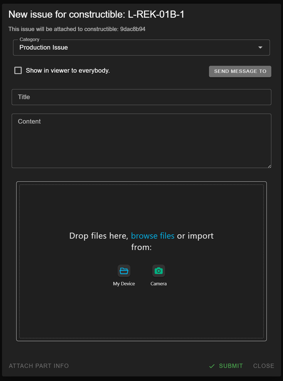
The issues button shows a badge with the count of active issues for this constructible.
- View issues — See all issues with their title, description, category, status, and attached pictures.
- Add issue — Create a new issue with a category, title, description, and optional picture upload. You can attach the current part information for context.
QR Code
Click the QR button to display a QR code for the current constructible. This can be printed and attached to the physical item for quick identification on the shop floor.
RFID Tag
Click the RFID button to register an RFID tag code for the current constructible. You can type the code manually or scan it using the camera.
Rack / Logistics
The rack button shows whether the constructible has been loaded into a delivery rack.
- Load to Rack — Mark the item as placed in a rack.
- Unload from Rack — Remove the rack assignment.
- Shows a visual representation of the rack arrangement.
Specifications & Documents
Switch to the Docs mode in the right panel to view specification documents associated with the constructible. These may include finish specifications, hardware specs, or other technical documents in PDF or image format.